


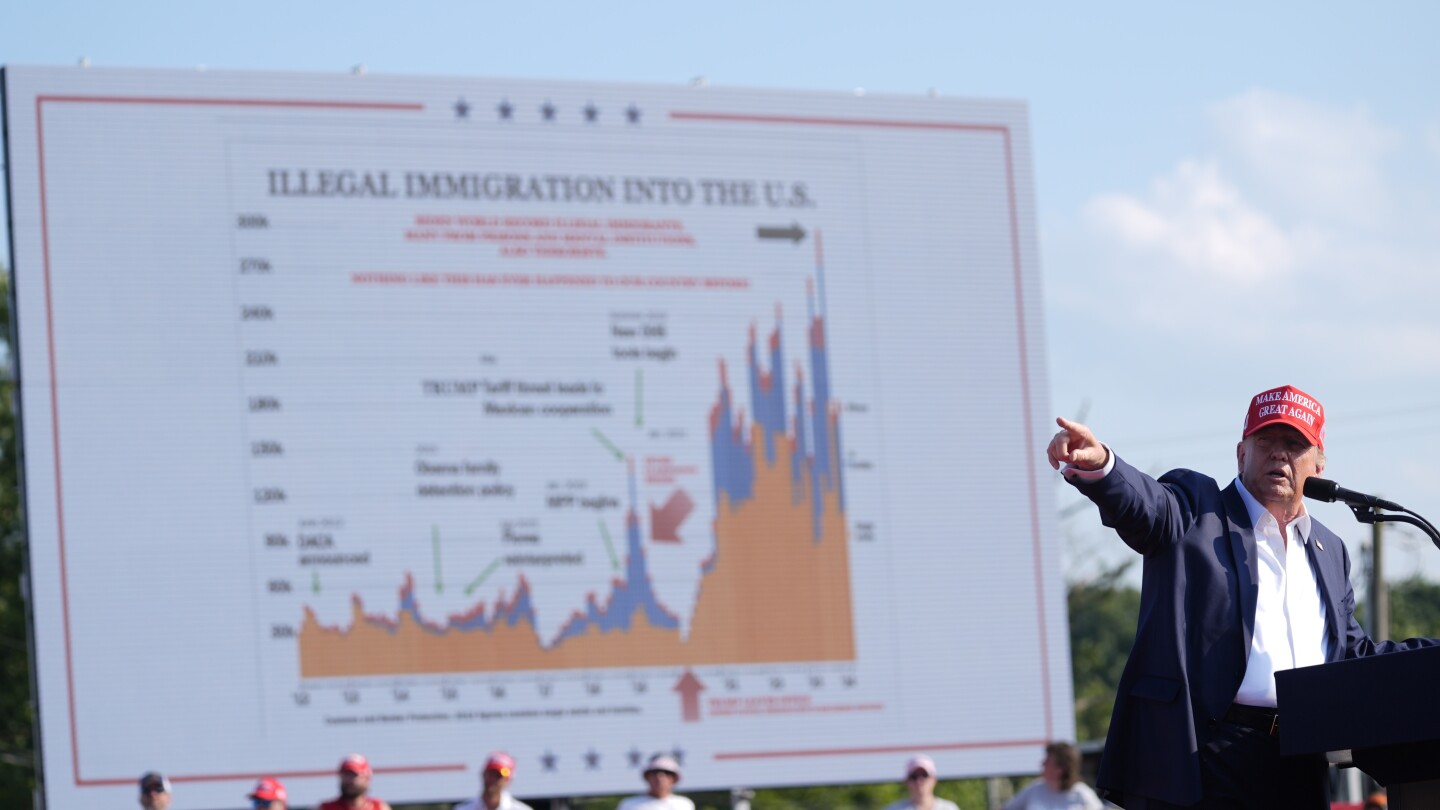
Former President Donald Trump has been using a bar chart as a campaign prop ever since an assassination attempt at one of his rallies in Pennsylvania. Trump credits the chart for saving his life, as he was reviewing it when the gunfire began. The chart details U.S.-Mexico border crossings during his administration and President Joe Biden’s term. Trump has professed his affection for the chart, stating that he loves it more than the police and that he will sleep with it for the rest of his life. This chart helps Trump connect his campaign to his signature issue of illegal immigration and highlights his administration’s stance on border measures.
The chart was given to Trump by Senator Ron Johnson while on his plane in April. Johnson showed Trump the chart, displaying a significant increase in encounters with migrants at the southern border during Biden’s term using statistics from the U.S. Border Patrol. Trump’s communications team then edited the chart for use at campaign events, where Trump made statements about illegal immigrants who were suspected of crimes. Johnson praised the chart for showcasing Trump’s successful handling of immigration issues and criticizing the Biden administration for an influx of illegal immigrants under their watch.
Border crossings hit record highs during the Biden administration, but they have since fallen after Biden implemented measures to curb asylum claims. The chart highlights Trump’s policies, such as the “Remain in Mexico” program, which aimed to reduce border crossings. However, the chart also includes misleading claims about illegal immigrants from prisons and mental institutions, an assertion made by Trump during rallies but lacking evidence. The chart fails to mention Trump’s controversial family separation policy, which was widely condemned and halted under pressure from his own party.
The chart used by Trump incorrectly identifies the month he left office, marking it as if it happened in 2020 during the pandemic, which significantly reduced border crossings. Representative Robert Garcia pointed out this error during a recent congressional hearing. The chart also omits Trump’s family separation policy, a significant part of his immigration record. Trump rarely discusses this policy and has focused on mass deportation as part of his future plans for immigration. The chart has become a recurrent feature in Trump’s speeches and campaign events, with him attributing his survival during the assassination attempt to it.
Trump has displayed the chart at various events, including his Republican National Convention speech and a recent border visit to Arizona. He frequently recounts the story of how the chart saved his life and emphasizes its importance in his campaign. Senator Johnson, who provided Trump with the chart, believes it played a role in Trump avoiding assassination. He notes that Trump has been using the chart more often after the incident and claims that Trump’s survival was either the hand of God or serendipity. Trump has not publicly mentioned the chart to him since the assassination attempt, indicating that those conversations are private.


